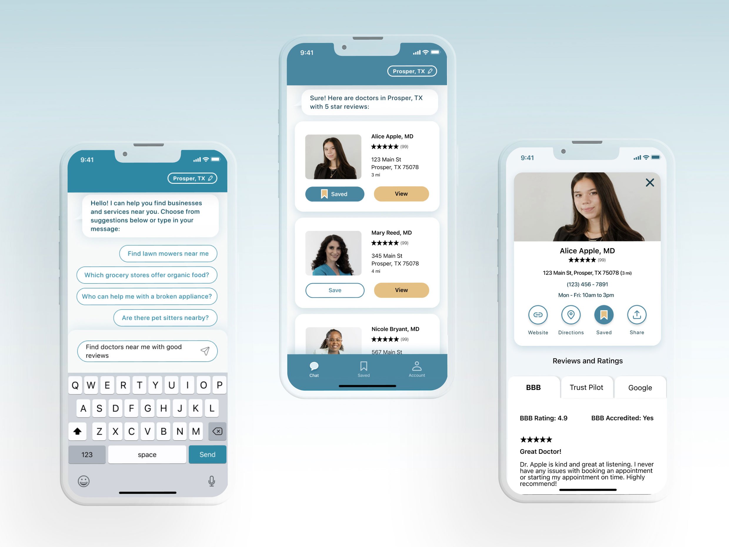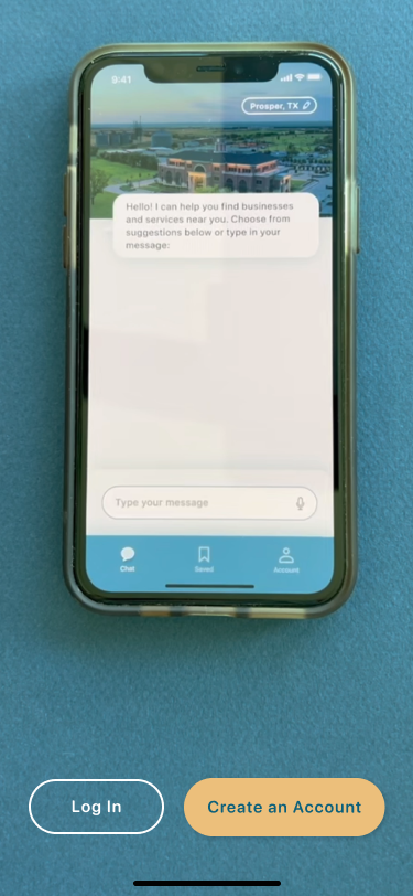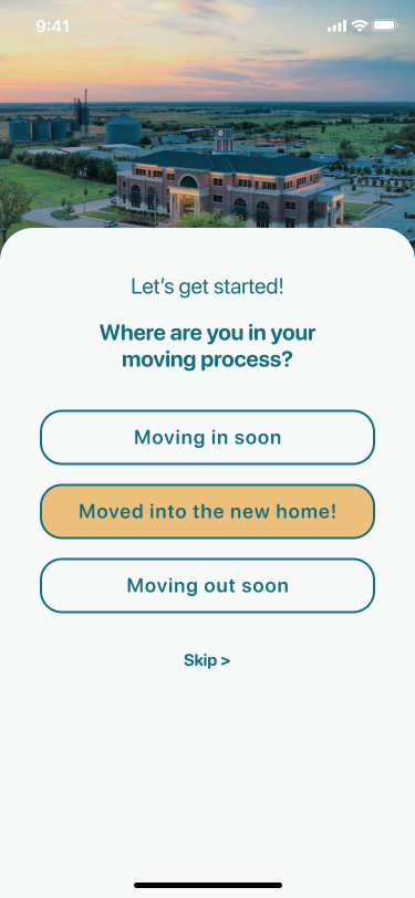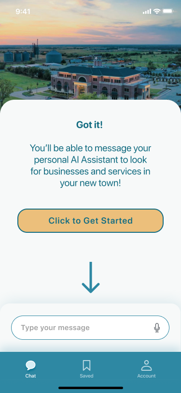
Home Again is an iOS mobile app that uses generative AI to help homeowners quickly research their new neighborhood.
Timeline: Nov ‘22 to Feb ‘23, Jul - Aug ‘23
My Role: Research and UI/UX Design / Solo Bootcamp Project
Tools Used: Pen and paper, Zoom, Google Scholar, Miro, Figma, Marvel App
-
I had the freedom to choose my research topic for this bootcamp project, so I chose one that I had personal experience with. I have moved across 3 countries, several states and cities, so I felt a connection with the topic of stress related to moving. I was curious to know how others dealt with this and what common issues we faced.
-
Problem
Moving to a new home is stressful and it takes a long time for new homeowners to settle in, discover what’s nearby, and get back to their day-to-day.
-
Solution
Generative AI can cut down on the time it takes for new homeowners to research businesses and services in their new town.
“45% of Americans find that moving is one of the most stressful events in their life.”*
-
According to an SWNS study, the most stressful parts of moving include
packing
sorting/donating
making a downpayment
budgeting for moving
saving enough to sign a temporary lease
-
After moving in, homeowners are stressed about
home repairs
security/break-ins
mortgage increases
and natural disasters
researching all of these topics and being prepared
-
*SWNS Staff. “Americans think THIS is more stressful than divorce, marriage, and even having children.” SWNS Digital, 6 Sep, 2021. https://swnsdigital.com/us/2020/09/americans-think-this-is-more-stressful-than-divorce-marriage-and-even-having-children/
**SWNS Staff. “Americans think THIS is more stressful than divorce, marriage, and even having children.” SWNS Digital, 6 Sep, 2021. https://swnsdigital.com/us/2020/09/americans-think-this-is-more-stressful-than-divorce-marriage-and-even-having-children/
***Tori G. Roughley. “U.S. News & World Report New Homebuyer Worries Survey 2022” Mortgage Introducer, 18 Oct, 2022. https://www.usnews.com/insurance/homeowners-insurance/new-home-buyer-survey
Recruiting Participants for Interviews
I sent out a screener survey, and it was completed by 26 people who were asked background questions about when, how far, and how they felt about moving to a new home. Their responses helped me to recruit 5 participants for user interviews after this step.
On a 10-scale, 65% of survey takers said they felt 5 or more in terms of how stressed they felt after moving into their new home.
84% of survey takers said it took more than 6 months to feel settled into their new home.
Competitive Analysis:
-
Nextdoor
Pros: Neighbors are already using the app and good for making connections.
Cons: Only businesses who are using Nextdoor are able to make a business page, and only reviews from other Nextdoor members appear. The reviews show that it has become more of a platform for bias and un-neighborly behavior.
-
Facebook Groups
Pros: Users are already using it and familiar with its interface and how to navigate it.
Cons: Hard to find specific groups and have to wait for group request to be accepted. Also too many inactive groups with little engagement.
-
Thumbtack
Pros: Easy way to see reviews, distance to customer, and prices, and offers many different service providers.
Cons: Lack of customer service and many scams have happened to make users lose trust.
Interviewing participants with moving experience
To understand the struggles of my users, I needed to ask them the right questions. I recruited 5 participants from my screener survey who had: 1) moved to a new home in the last 3 years, 2) shared detailed responses, and 3) mentioned they felt stressed before/after moving to a new home.
-
First off, thank you for helping me with this research! This is going to help me make sure that I’m designing my product to be as useful as possible! So to start…
I’m working to design an app or website that will help new homeowners who are adjusting to their new area. I’ll be asking questions about your experiences with your new home, and by new home I’m referring to your most recent home that you’ve purchased. I’ll also be asking questions about how you’re liking your new area, which can include your neighborhood and your town in general.
Could you tell me about your feelings or experiences with your home so far? What do you like or dislike about it?
Could you describe how you settled into your home and describe any examples of what you personally did to settle in?
From the example(s) you mentioned, did you face any struggles while trying to settle in?
Follow up probing questions: So while settling in, did you wish anything could have been better than how it was and can you please share some examples about that?
Tell me about your neighborhood and town; what are your feelings and experiences so far? What are your favorite things about it?
What does it mean to you, to feel at home?
Do you feel that any of the homes you’ve lived at in the past were your favorite? Could you tell me why you think it was a favorite?
So now if we fast forward into the future, how do you think you’ll remember your current home? And can you tell me why?
What do you feel makes a home memorable?
I’d love to learn about your experience with your neighborhood and town. What has been your favorite way to explore the area?
What makes you feel more connected with your neighbors and local area?
The next question is about apps and sites you might have used. Can you tell me about a time when you had a good experience learning about an event that was happening in your neighborhood through an online source or app?
Did that (app or site) affect your feeling or experience with your new home?
If you could make a wish for a better experience in your new home and neighborhood, what would it be? Follow up: do you have any other thoughts, wishes or suggestions about your home experience?
And finally, from what you’ve personally learned about the moving and adjusting period, what advice would you give to another new homeowner who is just starting their process?
Organizing interview transcripts
After gathering my notes from user interviews, I highlighted quotes and grouped similar themes together to discover common themes.
-
New homeowners want to feel connected to their community
They want to unpack, settle in, and feel at home again
They’re finding it hard to prioritize all the things on their to-do lists
They wish moving could be easier
They would advise others to research before moving in
Meet Joanna, our User Persona
Mother, Engineer
Recently moved to a new home
Exhausted with the moving process and settling in not just herself but her family too.
-
I needed a way to empathize with the person that represented my user. Someone who wasn’t me, because that would limit my perspective. And that’s where the user persona came in.
BUT - before I created a persona, I created an empathy map because after the user interviews, I was already organizing the transcripts to create an affinity map. And putting the post its into an empathy map further helped me organize the themes I began to see. However, I had a limited timeframe and needed to be ultra-focused on my MVP. The empathy map allowed me to understand multiple potential problems to solve for, but creating a persona helped me to pinpoint THE problem to focus on.
Framing the Problem
-
How might we reduce the amount of research that new homeowners need to do once they move in?
On to the MVP
Guided by the HMW statement, I drew out user flows to imagine the path that Joanna’s search process would take from start to finish. These user flows allowed me to envision the steps taken from start to end, which would then guide my low-fi design process. I also used a red routes analysis to determine which features would be included in the MVP.
-
Strategically thinking about the order of the screens through user flows helped me visualize these steps later in the sketching phase. The user flows also ensured that I paid attention to details like back buttons and navigation icons since they take into account the entire customer journey from start to finish.
-
This chart helped me pinpoint which features I would include in the MVP. There were many others that I could have hypothetically added, but they would not have optimized the most important needs of the user. So this chart gave me a system to prioritize the most important features.
From Sketches to Wireframes
I took my user flows and red routes as a guide to begin sketching ideas for this solution. After a round of guerilla testing, these are the three areas I focused on improving for my wireframes: 1) make a clear onboarding process, 2) ask “how is this solution better than just googling?” and 3) allow users to control how they share their location.
Style Guide
For branding, I chose cool colors to keep the mood calming, and earthy orange to symbolize cheerfulness and encouragement. Since Joanna is going through a stressful time, creating a down to earth, soothing brand image will match her needs.
-
Logo: I wanted to represent the brand personality in the logo, so I -
• Used calming blues with comforting orange
• Kept the illustration simple
• Sparingly used a gradient at the top of the house to symbolically reflect the sunlight
Font: I chose the font SF Pro Rounded to keep it clean and readable. The rounded font family matches the curved corners of the icons, bottom sheets and cards. This helps create softness to keep the brand image calming.
Components: The icons I designed are rounded and minimalistic with a simple 2pt line stroke that is easy to see on a white or dark background. I applied the same concept to the buttons - rounded edges to create a pill shape, and a slight shadow to give them some hierarchical importance on the page.
-
These are the design decisions I considered when making sure the app would be accessible:
* Color contrast conforms to WCAG AA and AAA Levels
* Descriptive headings help users orient themselves on the page (business listing page, saved searches page)
* Create Account form gives user feedback on whether their password meets the 8 character requirement with a green check or red “x”
The main challenge I faced was being able to use the soft blue colors I originally chose. However, using them would not have been accessible.
Curve ball…
After taking a personal break from the project, I came back to a new development in the tech world.
By June 2023, 100 million people were using ChatGPT. The way we used search was transforming.
And I was onboard. I updated my wireframes to get closer to my HMW statement. Now, Joanna will have less manual research to do.
Back to the drawing board
I started with low fidelity wireframes and took my experience with Chat GPT powered apps to redesign the flows for my MVP, which included the sign up flow, browsing businesses, and changing location.
High Fidelity Screens
Now I needed to translate the low fidelity into high fidelity in order to test a working prototype that will give users a better testing experience with the app.
-
Since the objective is to reduce time spent researching, this also applies to reducing time searching for things within the app.
I used a top navigation bar that stays consistent and allows the user to update their location at any time. This made sense rather than only allowing this action to take place on one specific page, and saves the user time navigating between pages.
I also used a bottom tab bar which includes the 3 primary tabs (chat, saved, and account) that a user would need. This tab is shown on all screens except for full screen overlays or bottom sheet overlays. Once those are closed, the tab is viewable.
-
I used bottom sheets during the onboarding flows and for the “update location” flows.
For onboarding:
* Bottom sheets allowed the user to view the video/graphics while having access to the “create account” and “login” buttons; the sheet complemented the content on the screen.
* The repetition of the sheets on subsequent screens offers a way to gradually flow into the home screen of the app.
For updating location:
* While the update location button is in the top right corner, tapping on it opens up the bottom sheet where the location is updated. This is because the bottom sheet is more ergonomic for typing into the fields.
* Users can update their location from any screen, so having a bottom sheet allows them to stay on the same page and if necessary, view what they were doing before tapping on the location button
-
Sometimes users simply don’t know what to search for (or in this case, message about). For this reason, I included suggested searches to help them understand how they can frame their questions. I intentionally kept the messaging page simple to create familiarity with other messaging apps and chat bots, and to get the user into the mindset of asking questions rather than formulating key words for their search.
Usability Testing
I conducted 2 rounds of moderated usability tests, each with 5 different participants who experienced moving to a new home in the past. Going into the testing phase, I wrote up my main research questions:
Do the users have difficulty with any of the steps required to find a business or service?
Is it intuitive for the user to change their location?
Do users feel the AI chatbot will reduce time researching?
-
Introduction:
Hi, __! How are you doing?
I’m working on an app for new homeowners who have just moved into a new neighborhood, and it helps them to find businesses and services nearby. and I’d like to share it with you and learn about your experience with it. I have three tasks that I’ll be requesting from you to do in the app, and please talk through your thoughts freely as you're doing these tasks. There are no mistakes, the goal is just for me to understand how the flow of the app is working.
Is it ok with you if we record our session today?
Warm Up:
To start off, can you tell me about any moving experiences you’ve had?
Tasks:
Let’s say you’re a new homeowner who just moved into your home and you found this app to help you explore your new city. Please go ahead and create an account.
Now that you’re in a new city, you’d like to look for a doctor with good reviews who is within 3 miles of your home. How would you do this?
Let’s say you’d like to look for a business in a nearby town; how would you update your location?
Follow Up:
Those are all the tasks, thank you for going through them! Were there any challenges you faced while going through them?
What would you say this app is most useful for?
[If they had trouble with any task] I didn’t want to break the flow while you were [doing x task], but could you tell me what challenges you came across on the [x] task?
Conclusion:
Ok, that concludes our session for today - thank you so much for your feedback! I’ll be able to use it to fine tune the app and hopefully it can help new homeowners in the near future!
Testing Round 1


Testing Round 2
"The video was a little long so I just went ahead and created my account. Maybe if it was shorter it could be more helpful."
Key Learnings and Next Steps:
AI can help us save time on tedious tasks, and many have welcomed that aspect
Since not everyone is used to generative AI, onboarding and tool tips can help them feel more at ease about what it can do for them
To continue improving the app, I would do a diary study of how users of AI apps feel about the information they provide and any concerns they might have
Another important consideration for this app is to understand how to align business goals with user needs - should the business use a freemium model and offer paid features?
If you’d like to hear more about my work, get in touch any time!


![[Mockup] iPhone 13.png](https://images.squarespace-cdn.com/content/v1/64b973f82511950226e815a6/9b091a86-2303-4e96-a30d-29d3b7c9223d/%5BMockup%5D+iPhone+13.png)
![[Mockup] iPhone 14.png](https://images.squarespace-cdn.com/content/v1/64b973f82511950226e815a6/5947dbd2-ab98-456f-9204-d9d0668af661/%5BMockup%5D+iPhone+14.png)
![[Mockup] iPhone 15.png](https://images.squarespace-cdn.com/content/v1/64b973f82511950226e815a6/8cc3df18-6f08-4be0-898a-abdffecce9cd/%5BMockup%5D+iPhone+15.png)
![[Mockup] iPhone 16.png](https://images.squarespace-cdn.com/content/v1/64b973f82511950226e815a6/5ae7e741-8e9b-4b01-9698-569b5bc60e27/%5BMockup%5D+iPhone+16.png)
![[Mockup] iPhone 17.png](https://images.squarespace-cdn.com/content/v1/64b973f82511950226e815a6/1ee62279-8e4c-4d56-b1fb-86c3864bb5f4/%5BMockup%5D+iPhone+17.png)
![[Mockup] iPhone 14a.png](https://images.squarespace-cdn.com/content/v1/64b973f82511950226e815a6/ed10807c-14f0-45e5-8285-9105e26de2fa/%5BMockup%5D+iPhone+14a.png)
![[Mockup] iPhone 15a.png](https://images.squarespace-cdn.com/content/v1/64b973f82511950226e815a6/5b573121-c1ba-4554-9eb9-1b86ffa21abb/%5BMockup%5D+iPhone+15a.png)
![[Mockup] iPhone 19.png](https://images.squarespace-cdn.com/content/v1/64b973f82511950226e815a6/e475749e-5244-47f6-a3f2-6d5dd1e955ff/%5BMockup%5D+iPhone+19.png)
![[Mockup] iPhone 16a.png](https://images.squarespace-cdn.com/content/v1/64b973f82511950226e815a6/0a4995ee-0c41-4e28-ac00-a71a1d469c9c/%5BMockup%5D+iPhone+16a.png)
![[Mockup] iPhone 17a.png](https://images.squarespace-cdn.com/content/v1/64b973f82511950226e815a6/204932ca-169d-4ab7-ad2d-6e0a18c93ce5/%5BMockup%5D+iPhone+17a.png)
![[Mockup] iPhone 18a.png](https://images.squarespace-cdn.com/content/v1/64b973f82511950226e815a6/56013bd4-cad3-49de-8d96-ff900f19066f/%5BMockup%5D+iPhone+18a.png)
![[Mockup] iPhone 19a.png](https://images.squarespace-cdn.com/content/v1/64b973f82511950226e815a6/64c7dd5d-b3e0-4b4d-967b-8217b6f082e1/%5BMockup%5D+iPhone+19a.png)
![[Mockup] iPhone 20a.png](https://images.squarespace-cdn.com/content/v1/64b973f82511950226e815a6/647bb9b9-72d3-46d5-9268-b6e959dc74fb/%5BMockup%5D+iPhone+20a.png)
![[Mockup] iPhone 18.png](https://images.squarespace-cdn.com/content/v1/64b973f82511950226e815a6/d01419a8-b8bc-45d4-81eb-afd8893d5a20/%5BMockup%5D+iPhone+18.png)
