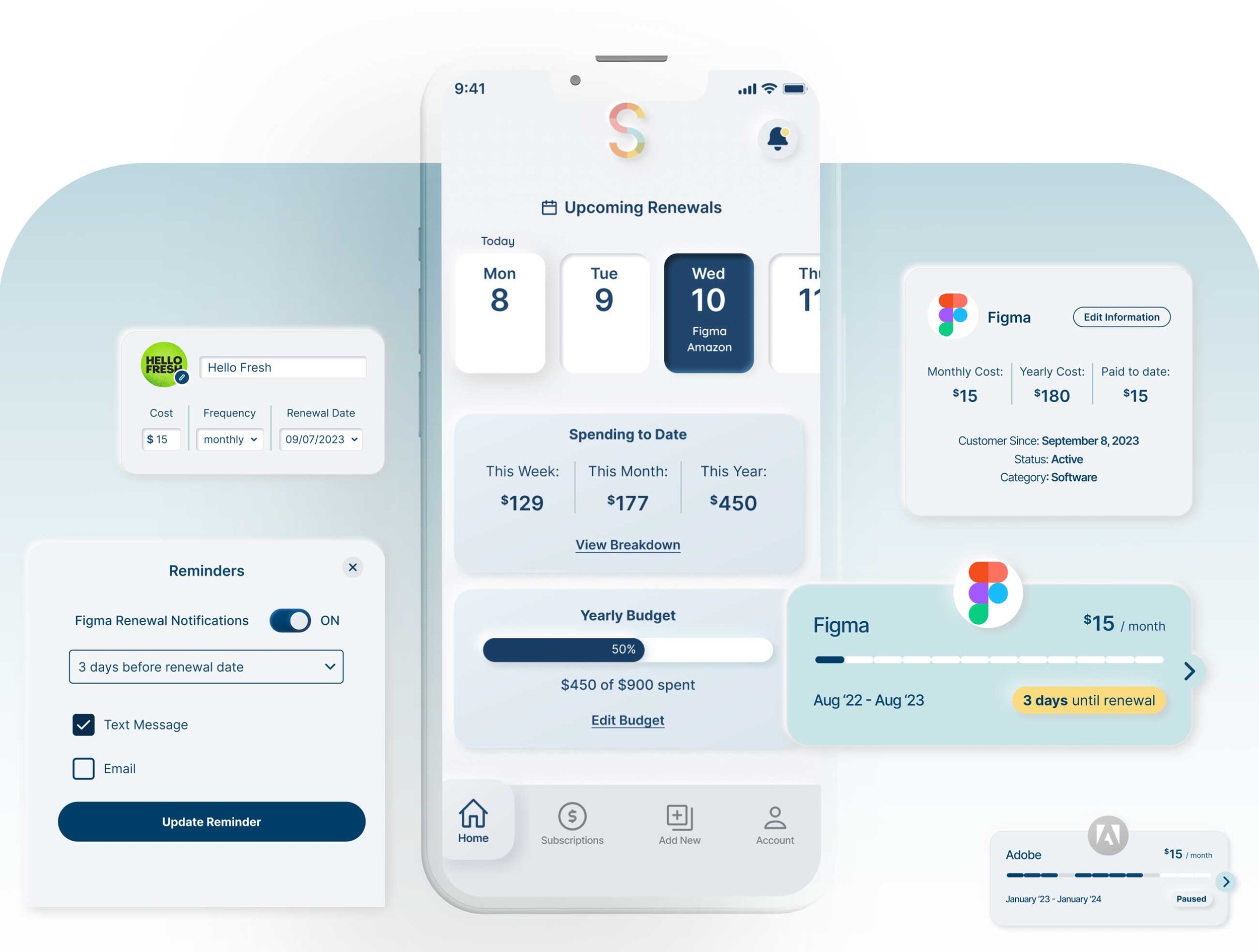
SubFlow is an iOS mobile app that helps subscription users manage their renewals with bite-sized visuals.
Timeline: August to September 2023
My Role: Research and UI/UX Design / Solo Bootcamp Project
Tools Used: Pen and paper, Zoom, Miro, Figma
-
This project stemmed from an exciting and challenging design brief about the challenges of a subscription management company. The background story is that this company is looking to grow its user base by making a mobile version of its desktop app. Without having seen this desktop version, my task was to research the subscription management space and understand what problems users were currrently facing. With that information, I could design a mobile solution that would serve this company’s users.
-
Problem
Managing subscriptions is time consuming and requires a lot of organizing. Subscription customers need a way to stay on track with payments to budget and avoid unnecessary payments.
-
Solution
Subscription customers require a tool that offers spreadsheet-like effectiveness without the manual labor. They also need to be able to quickly visualize a large list of data.
Here’s what we know from the project brief:
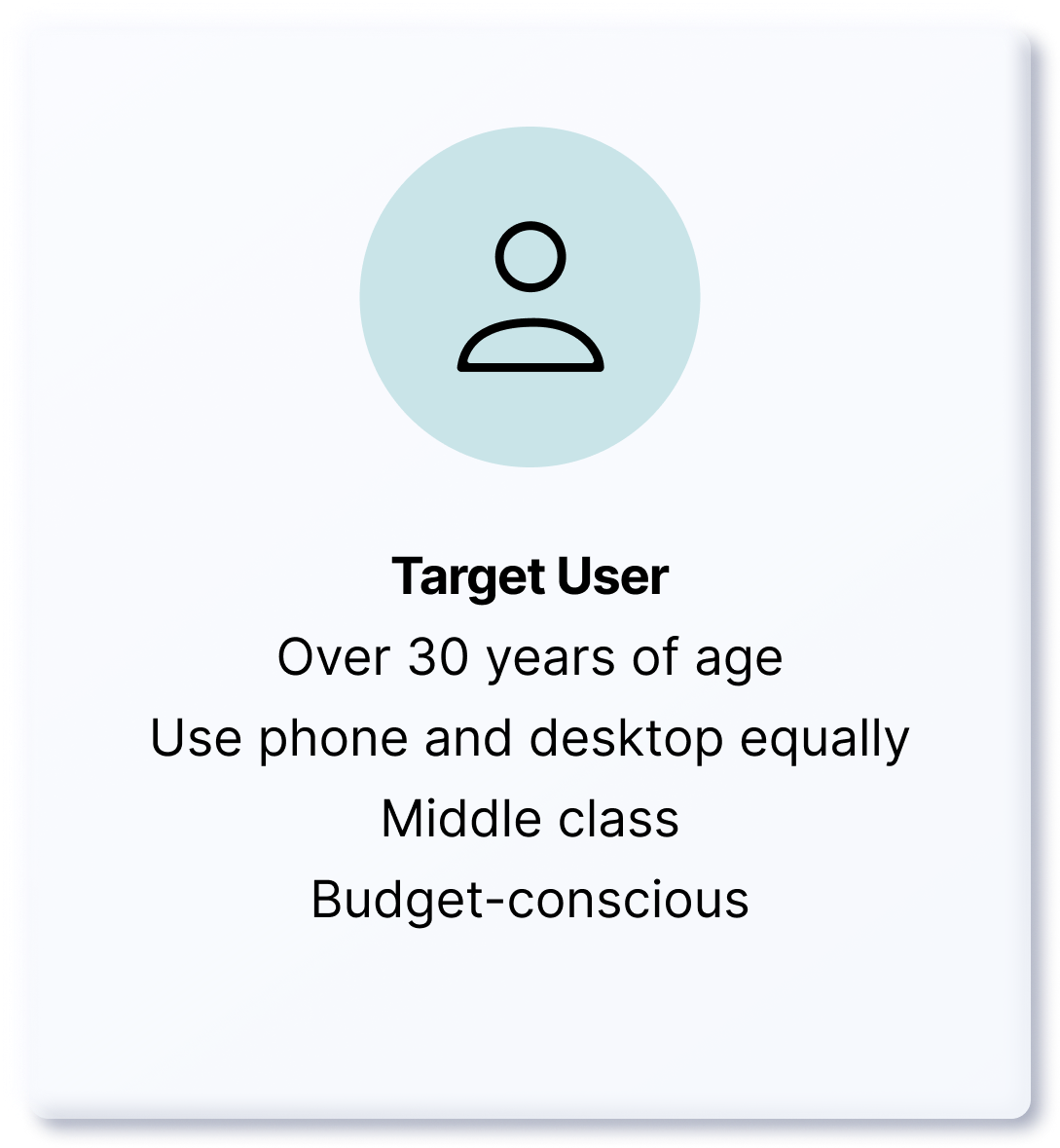
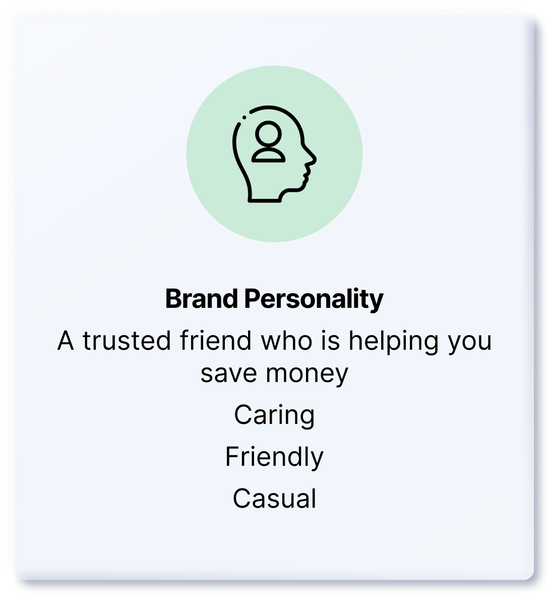
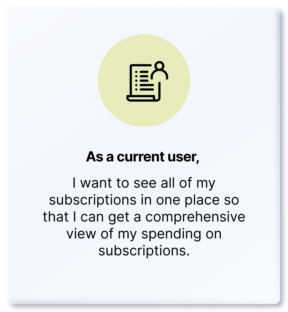
On to the research plan
I drafted these questions to begin my desk research:
How are subscription customers currently managing their renewal dates?
What is lacking in exisiting subscription management methods or tools?
What specific features are helping customers stay on track with renewals?
What other methods are customers using to keep track of subscriptions?
My first plan of action was to do a competitor analysis by looking at competitor reviews. This would give me an idea of what current users are liking and not liking about the tools they’re using so I could do a SWOT analysis.
I also needed to research the background of the subscription industry. My goal was to tap into existing studies and surveys that show how customers are feeling and responding to subscriptions. Knowing this would allow me to understand where the product I design fits within the current needs of the subscription marketplace.
How are customers responding to the rise in subscriptions?
-
An article from CNBC speaks to a study by C+R Research that was conducted with 1000 consumers in 2022, and almost ⅓ of them were likely to forget about recurring/automatic bills from subscriptions. 42% said they forgot about subscriptions that they no longer use, causing them to pay for unnecessary products. The article goes on to recommend subscription management apps such as Truebill and Mint to keep track of these renewals.
Key takeaway: Subscription customers need a way to manage their subscription renewals because they are easy to overlook.
Source: Sarah O’Brien. “Consumers spend an average $133 more each month on subscriptions than they realize, study shows” CNBC, June 22, 2022.
C+R Research. “Subscription Service Statistics and Costs” C+R Research, May 18, 2022. https://www.crresearch.com/blog/subscription-service-statistics-and-costs/
-
On the one hand, if we look at conversations on Reddit, some consumers are against the subscription model. Their main frustration stems from inability to keep up with them and avoid unnecessary costs. One reddit user says: “Companies want control over their products, they dont want you to *own* something because that means you are now indepedent of them. They want you to keep paying so they can keep making money without having to release a new product” And yet another user says “I stopped buying things that require subscriptions. There is literally nothing in consumer-land that I need that badly.” In the same way, many others are saying that they would avoid subscriptions so as not to give up control of their money to a business. The bottom line seems to be a loss of control of their money.
Key takeaway: There is some friction from consumers who do not want to keep track of subscriptions for a fear of losing control of their finances.
Source: https://www.reddit.com/r/NoStupidQuestions/comments/13pjfuz/why_is_everything_so_subscription_based_now_what/
-
Some subscription customers are making their own forms of management like one reddit user who created an Excel template for others to use as well. The comments to this template were positive, with users sharing appreciation but also asking if certain additional capabilities could be added. Some of these requests include the following:
“This looks amazingly useful! Is it possible to have a fortnightly option, though? I'd love to use it to help track things like AfterPay payments etc, and have all my bills in the one place, but I'm terrible with formulas.”
“New user, this is great. Would you be able to add a bi-annual option? (Every 6 months). A lot of car insurance companies bill this way.”
“Anyway to change $ to some other currency??”
“The summary and upcoming fields are helpful. I did something similar and it helped me cut expenses quite a bit. I also added a field to track where the subscription was, which card or which platform -- a lot of subscriptions are managed by Amazon or Apple, and I'd forget where they were.”
Key takeaway: Consumers who do subscribe to multiple services or products would like an easy way to manage their renewals. They also have specific needs for different subscription situations.
Source: https://www.reddit.com/r/Notion/comments/uwqppn/created_a_subscription_tracker_template_with_some/
Synthesizing Competitor Product Reviews
In order to organize the findings from competitor product reviews, I pasted reviews onto post-its using Miro and grouped them by similar themes. This helped me define trends which would soon help me shape some insights from this research.
After reading through dozens of reviews, I began to see the patterns in customers’ feedback.
I highlighted portions of the reviews and then organized them into four sections: what users say, think, do and feel. With this empathy map, I was able to shortlist the users’ main needs for a subscription management tool.
The next step was to generate insights from the affinity and empathy maps. I took overlapping themes and formulated insights. Below are the insights, which led to my “how might we” question:
-
Organizing subscription costs has helped users manage their renewals.
-
Importing subscriptions needs to be an easy process.
-
Users need to be able to customize how the app works for them.
-
How might we quickly organize subscription data into customizable visuals?
On to the MVP
With the overarching goal in mind, I opened up my red routes template and started thinking about the important features that SubFlow’s users’ would absolutely need in order to get the most value out of this app.
Then, I drew out the user flows using Miro. This helped me plan out the steps that users would take in order to reach their goal of managing their subscriptions.
Sketches
After visualizing the user flows, I began to sketch out layouts for the screens. I thought through a lot of options but when something didn’t seem like it would work, I wrote out the user stories on the side of my sketches to bring my thought flow back to the requirements of the user.
Wireframes
Next, I took my sketches to Figma and built out the low fidelity wireframes. As I was working on these, I was thinking about what questions a user might come across as they navigated the screens. I put those questions onto a test script to validate them through usability tests.
Usability Tests, Round 1
Since I was already thinking of questions while sketching and wireframing, I took my notes and prepared a test script to use in the first round of usability tests. I recruited 5 participants who were subscription customers and scheduled 20 minute tests to understand their experience with the app.
-
Hi __! Thank you so much for participating in this test! I will be sharing some low fidelity designs which are currently in grayscale since the app is in its initial stages. I’m looking to understand how users navigate through the app and if there are any issues that I can fix.
To give you a background on this app, it’s a subscription management tracker that helps you keep track of renewal dates. So I would like to give you a scenario, where you would be a user of this app, and I’d like for you to walk me through your steps as you navigate through the screens. This will just give me a clear understanding of how you’re experiencing the design.
For the scenario, please imagine that you are a customer of several subscription products and services. So you have a lot of renewal dates to keep up with. Let’s say you’ve been using this app on desktop already, but now it’s available on mobile. When I send you the link, please explore the app and walk me through your thoughts on the features that you come across.
[If they haven’t covered this yet] That was great, thank you! Next could you please tell me how you would check in on your current subscriptions?
And how would you add a new subscription?
Thank you for walking me through those steps so far!
I have one more question - which of the features or pages that you’ve seen do you think was most helpful to you?
Ok perfect! That’s all for the testing part, I’d like to open it up for any questions or suggestions you might have!
The top three issues that I found during testing were:
Didn’t understand the information in the homescreen calendar
Category page should be combined with subscriptions page
The pause and cancel buttons functioned differently than users expected
In my next iteration, I turned the wireframes into high fidelity screens that also incorporated the feedback from the usability tests.
High Fidelity Screens, Round 1
My first set of high fidelity screens were made after I put together a visual style guide. I chose colors that supported the brand’s personality. I wanted the logo to depict the colorful labels we often use to organize file folders. While the primary color in the background and cards is light and calming, the label colors add a pop of interest that helps users visually find the label they are looking for.
The design style I chose has neumorphic shadows create a minimalist look combined with graphics that inspire a realistic look. For accessibility reasons, I was mindful to use these shadows on sections that could still function without the shadows present.
Usability Tests, Round 2
With the iterations made after the first round of testing, I was curious to find out whether the new solutions would provide a more intuitive flow. I tested with 5 more participants who were subscription customers with the following test script:
-
Hi __! Thank you so much for participating in this test! I will be sharing a prototype of a subscription management tracking app which helps us keep track of renewals. I want to mention that this is the first MVP of the prototype, which just means that the foundational functionality is currently working. If you come across any links or buttons that don't work yet, please let me know what you think might happen after you click on it.
So before we get started, I’d like to give you a scenario: please imagine that you are a customer of several subscription products and services. So you have a lot of renewal dates to keep up with. Let’s say you’ve been using this app on desktop already, but now it’s available on mobile. When I send you the link, I’ll have four short tasks and these are to test if the app is working, it’s by no means testing you.
For the first task, could you please explore the homescreen and walk me through your thoughts? Feel free to click around if anything catches your attention.
That was great, thank you! Next, you’re trying to remember when your subscription for Figma is being renewed next. Could you tell me how you would find this?
Let’s say you just subscribed to a new subscription called Hello Fresh. Could you walk me through how you would add this?
And finally, while you were adding Hello Fresh, you realized you forgot to add Netflix on your subscriptions list. How would you add this?
Thank you for walking me through those steps so far!
I have one more question - which of the features or pages that you’ve seen do you think was most helpful to you?
Ok perfect! That’s all for the testing part, I’d like to open it up for any questions or suggestions you might have!
The top three issues that I found during testing were:
The calendar on the home screen was not intuitive for finding out upcoming renewals
The subscription page tabs caused confusion
The sections on the add subscriptions page are not defined
I had some rethinking to do with the way the calendar on the homescreen functioned. I wanted it to be compact and minimal (going with the goal of bite-sized visuals), but I needed a way for users to know which subscription(s) were being renewed without having to click around.
I went back to the drawing board, opening up a new page in my Figma file called “playground” to experiment with new components.
Iterations
Because users weren’t able to immediately understand which renewals were coming up next, I updated the home screen calendar with names of the subscriptions and a bottom sheet that shows more information.
Since the sorting tabs on the subscriptions page were mistaken for payment frequency rather than upcoming renewals, I removed them and included a sort and filter option within a bottom sheet.
And because users thought the “Add New” page offered only one option adding a subscription, I created 3 distinct sections with headers to make the features clear.
Key Learnings and Next Steps
To make sure this MVP serve its users well, I would need to conduct another round of usability tests to understand if my iterations improved the confusions from before or added any new ones.
I learned that organizing data for a product as complex as a subscription management app requires many rounds of testing and iterations because users have unique needs for different situations.
Balancing functionality with aesthetics was a challenge for this project due to the complexity of the data that needed to be organized. I found it useful to sketch out ideas and then pair them with user stories to make sure those ideas met users’ needs.


